- Brick by Brick
- Posts
- 💸 5 ads that sell without saying much
💸 5 ads that sell without saying much
The quiet ads that outperform the loud ones.
Toby Waller
July 04, 2025

Hey friend,
Most brands treat static ads like filler.
A way to “stay active” in the feed.
But not the kind of creative that actually converts.
That’s a mistake.
Great static ads can build trust, tell a story, and drive action faster than a 60-second video.
The secret?
They don’t try to do everything.
They do one thing brilliantly.
Here are 5 that nailed it, and what you can steal from each one 👇
1. Pore Favor - Clear Skin, From the Root
🧠 Principle: Use real reviews to prove real results
Instead of over-polished branding, this ad lets the customer do the talking, with a powerful Trustpilot review front and centre.
✅ “30 days” gives a clear, believable timeline
✅ “Makeup free to work” taps into confidence and emotion
✅ The background visual mirrors the product benefit (clear, clean, glowing skin)
What’s genius is how it pairs this with just one understated brand message: “Clear skin from the root.”
Why it works:
It sells a transformation, not a supplement. It’s relatable, specific, and grounded in proof. A masterclass in minimalism meets trust.

2. Sleep Drops – Better Sleep. In a Drop.
🧠 Principle: Reduce the product to its most elegant promise
This creative is textbook premium:
→ One core benefit (better sleep)
→ One elegant form (a single drop)
→ One timely CTA (“back in stock”)
The dropper image visually lands the message: this isn’t a pill, powder, or tea. It’s something refined - even luxurious.
Why it works:
The copy and visuals are in perfect sync. It’s calm, confident, and assumes the product’s value rather than yelling it. A great example of aspirational wellness branding.

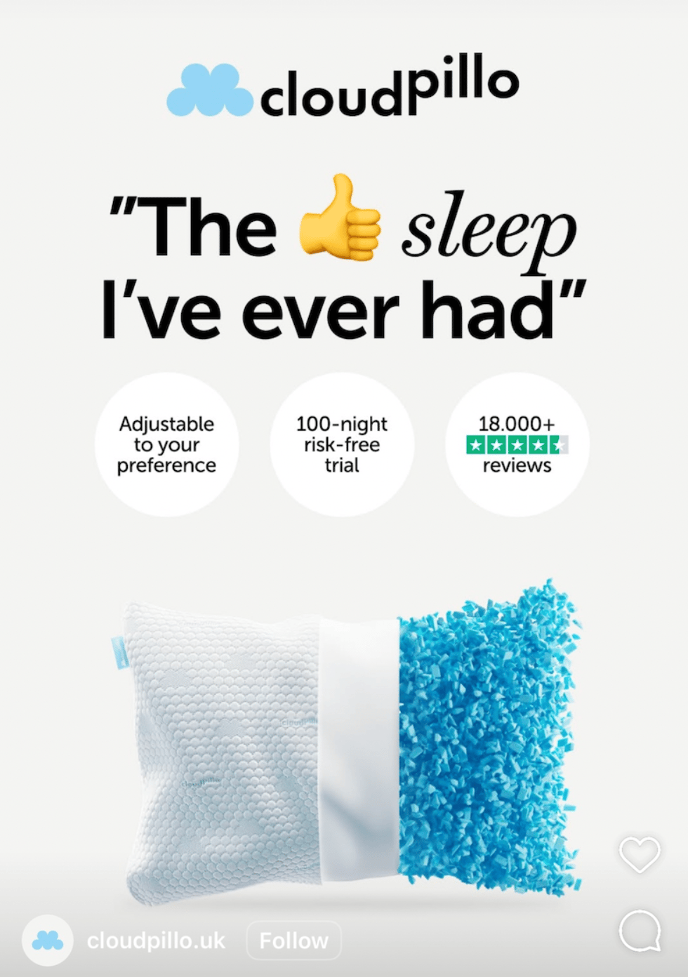
3. Cloudpillo
🧠 Principle: Let the emoji do the talking
“The 👍 sleep I’ve ever had”
It’s cheeky, visual, and instantly different.
Pair that with:
→ 18,000+ reviews
→ 100-night trial
→ Highly visual product cutaway
And you’ve got a perfect storm of trust, clarity, and contrast.
Why it works:
This is built for Meta. The emoji earns attention. The product visuals keep it. The reviews close the deal.
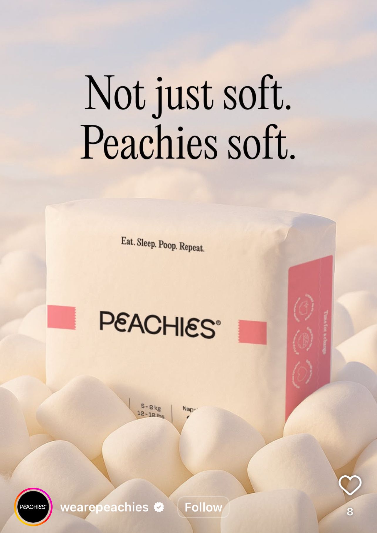
4. Peachies
🧠 Principle: Brand tone = creative asset
“Not just soft. Peachies soft.”
It’s playful, on-brand, and positioning-led.
The image? A nappy pack on literal marshmallows. Zero doubt what this ad is about.
Why it works:
You could blur the logo and still guess the tone. That’s brand strength. That’s scroll-stop.
5. Barebells Protein Bar
🧠 Principle: Visual deconstruction
This static breaks down the product with a dotted blueprint overlay:
→ 16g protein
→ Soft marshmallow
→ Crunchy peanuts
→ No added sugar
It’s simple, but highly effective for visual learners and impulse scrollers.
Why it works:
It answers “what is it?” and “why should I care?” at a glance. That’s static ad gold.

That’s a wrap for this week.
👉 Steal these.
👉 Adapt these.
👉 Test them.
Because good creative gets ignored.
But smart, scroll-savvy creative gets clicks.
Back in your inbox next week.
- Toby
Our 30-Day Pilot allows you to test our strategy, creative, and media buying without committing to a long-term contract.
We’ll plug into your account, audit what’s holding you back, and deploy new creative built to scale.
Clear improvements. Smarter testing. Zero fluff
If we don’t move the needle, you walk away. No questions asked.
Finance-led marketing is finally here.

After speaking with 100s of D2C marketers and operators, one thing is clear:
Scale now demands financial fluency.
We’ve built a community to help marketers master finance, learn frameworks that can support scale to 8 figures, and finally align marketing decisions with profitable outcomes.
Live now - join the community below: