- Brick by Brick
- Posts
- 5 static ads that cut through the noise this week.
5 static ads that cut through the noise this week.
No motion. No problem. These 6 statics convert harder than most videos.
Toby Waller
July 18, 2025

Hey friend,
Most static ads don’t fail because they’re bad.
They fail because they’re forgettable.
This week, I’ve pulled 5 examples that do the opposite… they stand out by being crystal clear, benefit-forward, and built for scroll-speed consumption.
These ads didn’t need motion to move people.
They let the visual do the selling.
Let’s break them down 👇
1. Hume Health - “98% DEXA Accurate”
🧠 Principle: Use authority as your opening line
This ad leads with trust:
→ 98% DEXA accurate
→ Trusted by 12,000+ clinics
Then brings the high-tech credibility into the home with clean, medical-grade visuals.
The 50% off offer + code is a direct CTA that complements (rather than distracts from) the core value prop.
Why it works:
This is a clinic-level solution, repackaged for consumers, and it feels like it.
Strong authority signal + clear incentive = scroll-stopping.

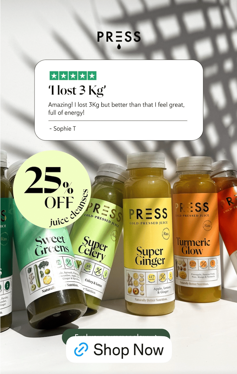
2. PRESS Juice - “I lost 3kg”
🧠 Principle: Lead with the outcome, not the ingredients
The ad copy is literally a 5-star review.
But it nails the formula:
→ Specific outcome (3kg lost)
→ Feel-good benefit (more energy)
Paired with crisp, colorful product visuals and a simple 25% off bubble, this ad feels like proof, not a pitch.
Why it works:
Social proof is more powerful when it’s not dressed up.
This ad keeps it raw and real, exactly what health-conscious buyers want.
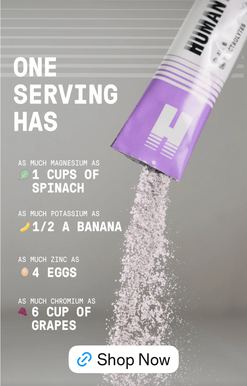
3. Humantra – “One Serving Has…”
🧠 Principle: Visual breakdowns build believability
This ad translates ingredient benefits into real-world comparisons:
→ Magnesium = 1 cup of spinach
→ Potassium = ½ a banana
→ Zinc = 4 eggs
It’s visual, snackable, and ridiculously easy to process.
Why it works:
No one buys “electrolytes” - they buy what they do.
This ad bridges the knowledge gap in seconds, making complex health benefits feel tangible and immediate.
4. Jennah Organics - “Got 10lbs of old waste stuck inside?”
🧠 Principle: Bold, benefit-first copy drives intrigue
This ad doesn’t beat around the bush - it opens with a problem no one wants to admit, but everyone reacts to.
Pair that with:
→ A visual that feels clean and apothecary
→ A money-back guarantee
→ 3 fast, symptom-driven bullets
And you’ve got a full funnel in a single frame.
Why it works:
It’s direct, human, and impossible to ignore.
The red underline under “Clean it out” draws the eye and reinforces urgency without feeling gross.

5. HIMS - “79% of customers wish they started sooner”
🧠 Principle: Use regret to create action
Instead of promising growth, this ad flips the script:
→ 79% wish they’d started earlier.
That’s not a feature, it’s a feeling.
It’s paired with a clean before/after and a calming visual layout that softens the message.
Why it works:
Regret is a powerful motivator.
This ad doesn’t say “look what you’re missing”
It says “don’t be too late.”
Subtle, but strong.

That’s a wrap for this week.
✅ Use these examples to inform your next static concepts
✅ Study how they handle proof, benefits, and objections
✅ Build faster, smarter, more strategic creative
Because when your static ads are this sharp
You don’t need motion to make people move.
Back in your inbox next week.
- Toby
Our 30-Day Pilot lets you test our strategy, creative, and media buying… without locking into a long-term commitment.
We’ll plug into your account, audit what’s holding you back, and deploy new creative built to scale.
Clear improvements. Smarter testing. Zero fluff
If we don’t move the needle, you walk away. No questions asked.