- Brick by Brick
- Posts
- 🚨 6 static ads that caught my eye this week
🚨 6 static ads that caught my eye this week
These real-world examples turn passive scrollers into buyers - here’s how to copy them.
Toby Waller
October 17, 2025

Welcome back to the Brick by Brick Newsletter… where 7–8 figure brands learn how to scale efficiently.
If you’re serious about growth and feel like you’ve hit a plateau, or you just want to put some rocket fuel on your growth… »snag a free audit« and we’ll uncover what’s holding you back and map out exactly how to break through and scale.
(We’ve got just two more spots open for brands to join us in Q4.)
This week’s issue breaks down one of the most underrated elements of a brand’s creative strategy: static ads.
Done right, they cut through noise, communicate value instantly, and sell in under three seconds (plus they’re super easy and cost-effective to whip up).
Here are 6 that I snagged this week that do it brilliantly, and the principles you can apply to your own ads:
1. Nutrafol
🧠 Principle: Results + Offer Stacking
This ad leads with a precise, time-bound outcome:
“See thicker, longer hair in 3-6 months.”
No vague promises. Just a clear expectation tied to a realistic timeframe.
Directly beneath, the subscription incentive “Save up to 20%” links results with habit building. If the customer wants those outcomes, the subscription becomes the obvious choice.
The product shot is clean and secondary. The headline does the heavy lifting.
Takeaway: Anchor your message in a measurable timeline. Combine it with a subscription or bundle offer to convert intent into recurring revenue.

2. Mott & Bow
🧠 Principle: Lifestyle Proof + Third Party Credibility
Instead of claiming “comfortable jeans,” the ad reframes comfort around a specific scenario: “Jeans you’ll actually want to wear on an airplane.”
That is instantly understandable. Everyone knows airplane discomfort. If jeans work there, they’ll work anywhere.
The credibility kicker comes from attribution to Condé Nast Traveler. Borrowed authority like this builds trust much faster than a brand statement.
Takeaway: Don’t just state your USP. Ground it in a real-life context, then reinforce it with third-party validation.

3. ARMRA Colostrum
🧠 Principle: Transformation Proof + Urgency
The classic “How it started vs. How it’s going” side-by-side format delivers instant visual proof.
For hair regrowth products, this is unbeatable. It taps into the primal belief that seeing is believing.
The 30% OFF badge adds urgency on top of the proof. Not only does the product work, but now is the moment to act.
Takeaway: For transformation-driven products, use side-by-side visuals that show real progress. Add urgency with discounts or limited-time CTAs to convert curiosity into sales.

4. Ritual
🧠 Principle: Customer Led Messaging
Instead of brand copy, the ad headline is a customer testimonial:
“Ritual made it super easy to know what I needed and was transparent to what goes into their vitamins.”
This does two things:
Removes bias by feeling like advice from a peer.
Reinforces key values like simplicity and transparency in customer language.
The detail “Subscriber since 2021” signals longevity, which addresses trust and retention concerns.
Takeaway: Elevate authentic customer language to headline status. It is often more persuasive than brand copy.

5. BaliBody
🧠 Principle: Ingredient Education
The ad reframes a self-tanner as a skincare product. That shifts the conversation from cosmetic to functional.
Surrounding the bottle with ingredient callouts builds trust instantly. Hyaluronic Acid, Niacinamide, Vitamin C and Ceramides are ingredients customers already recognize and associate with effective skincare.
The layout makes it easy to scan. You don’t need to read a paragraph to understand why the product matters.
Takeaway: If your product uses ingredients with built-in consumer trust, spotlight them visually. Show how they connect to outcomes.

6. Native
🧠 Principle: Simplicity + Authority
This ad is brutally simple.
Headline: “Say goodbye to dull skin.”
Proof: “Dermatologist tested.”
That’s it. One benefit. One authority cue. No clutter. No wasted attention.
The product is shown in hand, which humanizes the brand and makes it feel accessible.
Takeaway: A single strong benefit reinforced by an authority stamp can outperform complex messaging.

That’s a wrap
Apply these frameworks to your own ads.
Test fast. Cut what doesn’t land.
Double down on what does.
Because in a busy feed, clarity beats cleverness.
Back next week,
Toby.
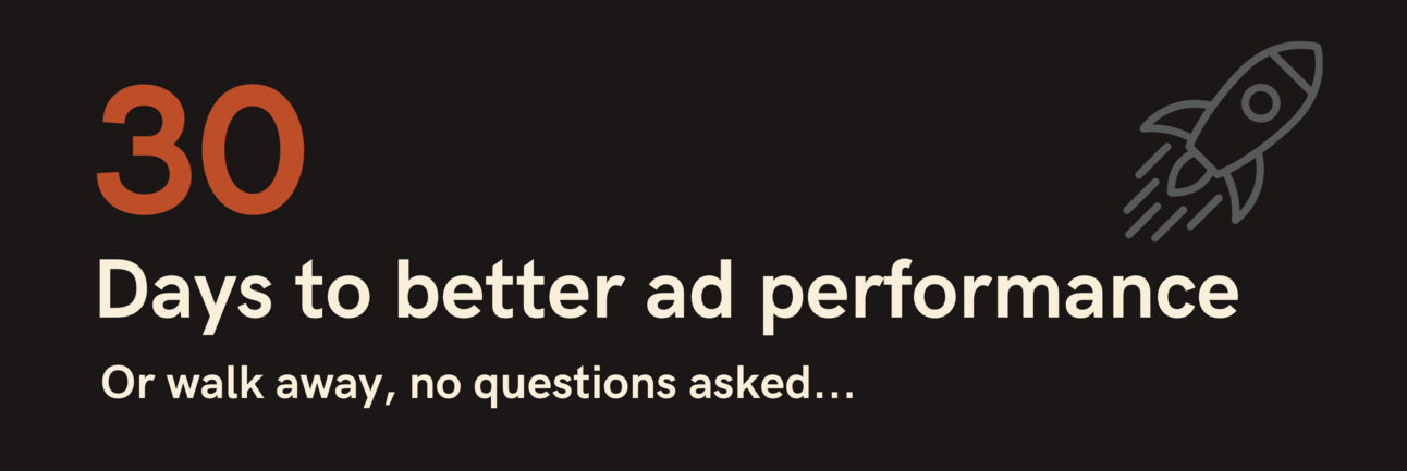
PS: Our 30 Day Pilot lets you test our full system of research, creative, and media buying without long-term commitment.
We’ll find the bottlenecks, build ads designed to scale, and prove it inside your account.
If we don’t move the needle, you walk away.