- Brick by Brick
- Posts
- 🚨 static ads every DTC marketer should study
🚨 static ads every DTC marketer should study
Pulling apart the highest-performing visuals in paid social... and the conversion psychology powering each one.

Welcome back to the Brick by Brick Newsletter… where 7–8 figure brands learn how to scale efficiently.
If you’re serious about growth and feel like you’ve hit a plateau, or you just want to put some rocket fuel on your growth… »snag a free audit« and we’ll uncover what’s holding you back and map out exactly how to break through and scale.
Static ads are still one of the most reliable weapons in paid social…
when they're built properly.
This week, I broke down 6 winning statics across different industries, and the conversion psychology behind them.
Steal the frameworks 👇
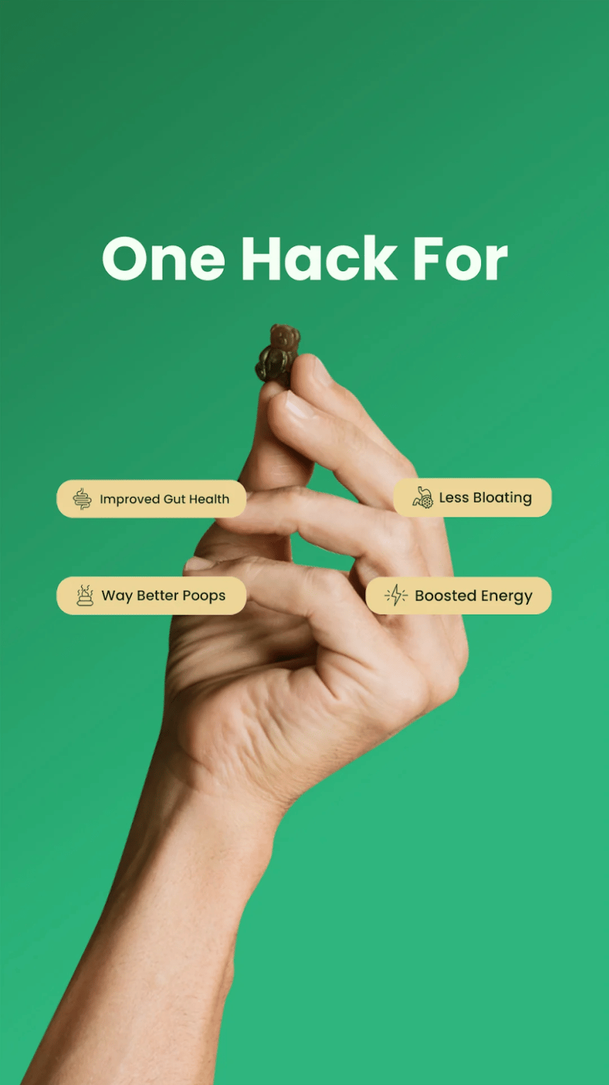
1. Gruns
🧠 Principle: Fast-scanning benefits + curiosity visual
Why it works:
One Hack For = curiosity frame that promises simplicity → frictionless buy-in
Benefits displayed as icon + short line = fast processing, instantly skim-able
The gummy held in fingertips → micro-dose visual reinforces “easy daily habit”
The magic:
This ad uses outcome clusters (gut health → digestion → bloating → energy) to capture multiple entry points while keeping the hero action tiny and achievable.
Takeaway:
Lead with simplicity + outcomes.
Visualize the habit. Keep benefits punchy. Hook curiosity before explaining.

2. ARMRA - “GOODBYE BLOAT”
🧠 Principle: Social proof headline + visceral pain relief storytelling
Why it works:
GOODBYE BLOAT is bold, emotional, and immediate (pain-removal > benefit)
Highlighted line reinforces chronic suffering → relief = massive trust unlock
Real customer photo holding product → authenticity + “this could be me” effect
The magic:
The highlighted text is the real hero. It makes the reader feel the pain and the relief. This is textbook empathy-to-authority transition.
Takeaway:
Use testimonials that tell a before → pain → failed attempts → breakthrough narrative. Highlight the emotional parts, not the product name.

3. Tropeaka - “Want longer, thicker hair?”
🧠 Principle: Identity aspiration + visual result cue
Why it works:
Question headline pulls curiosity + self-diagnosis (“Do I want this?”)
Hair-first framing — the product is secondary to the aspirational result
Lighting and composition = organic, authentic, not polished influencer gloss
The magic:
The back-of-head shot is clever; you see the result, not the seller, making the customer mentally place themselves in the frame.
Takeaway:
Lead with the outcome visually.
Let the product quietly sit in the supporting role.

4. “F##%K YOUR KHAKIS”
🧠 Principle: Category attack + brand attitude
Why it works:
Pattern-breaking profanity (borderline but scroll-stopping)
Direct enemy: khakis → clear positioning = “we’re the cooler upgrade”
“Stretch denim” benefit lands immediately after the attitude hook
The magic:
This is identity marketing - not just jeans, but rejection of boring style & comfort trade-offs.
Takeaway:
Define your villain.

5. Sunday Bedding - “HOT PEOPLE SLEEP HERE”
🧠 Principle: Double-meaning hook + comfort problem-solution
Why it works:
“Hot people sleep here” = playful + double hook
attractive people
overheating sleepers
Subheadline clarifies benefit: cools you in the heat
Cozy nighttime imagery sells emotional comfort
The magic:
Humor + product utility = rare combo.
It positions the product as confidence + comfort in one line.
Takeaway:
Combine personality + product proof.
If you can make someone smirk and nod, they’ll click.

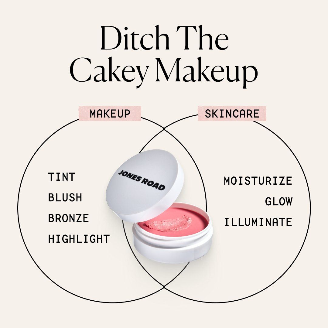
6. Jones Road - “Ditch The Cakey Makeup”tive
🧠 Principle: Anti-problem headline + category reframing
Why it works:
“Ditch the cakey makeup” = rejects the competitor outcome
Venn diagram reframes: this isn't makeup, it's makeup x skincare hybrid
Feature list vs benefit list — fast clarity on dual utility
The magic:
The Venn visual simplifies a complex differentiation story into one graphic. This is how you sell a hybrid product in a second.
Takeaway:
If your product collapses categories, diagram it.
Make the shopper say: “Oh… I get it. It’s both.”

That’s a Wrap
Turn static ads into high-leverage direct-response weapons.
📌 Keep it visual
📌 Anchor to a single big promise
📌 Make the first line emotional or identity-triggering
📌 Compress proof into the design (icons, highlights, third-party claims)
Clarity > cleverness.
Emotion > features.
Outcome > product.
Back next week,
Toby

PS: Our 30 Day Pilot lets you test our full system of research, creative, and media buying without long-term commitment.
We’ll find the bottlenecks, build ads designed to scale, and prove it inside your account.
If we don’t move the needle, you walk away.