- Brick by Brick
- Posts
- 🚨 Stop sleeping on static ads - these 6 still crush
🚨 Stop sleeping on static ads - these 6 still crush
Everyone’s chasing UGC. The smartest brands are scaling with clean, quiet statics that do one thing perfectly: sell.
Toby Waller
November 14, 2025

Welcome back to the Brick by Brick Newsletter. Where 7-8 figure brands learn how to scale efficiently.
If you’re serious about growth and feel like you’ve hit a plateau, or you just want to put some rocket fuel on your growth… »snag a free audit« and we’ll uncover what’s holding you back and map out exactly how to break through and scale.
This week’s issue breaks down six high-performing static ads that show you don’t need UGC, motion, or high-budget video to sell effectively.
Each one nails the fundamentals of performance creative: clarity, curiosity, credibility, and conversion.
Before we dive in, a quick announcement:
We’ve officially launched email marketing as a service.
If you're looking for a new retention partner, reply to this email and I’ll introduce you to our world-class head of email, Brad.
For this month only, we're offering a Free Campaign Redesign - send us one of your past email campaigns and we’ll rebuild it Brick-style with stronger hooks, structure, storytelling, and conversion elements.
You’ll see exactly how we’d elevate your retention revenue before we even start working together.
1. Grüns - The Pain-to-Relief Split Frame
🧠 Principle: Relatable humor + visual contrast
Why it works:
Side-by-side framing instantly communicates transformation - pain vs relief.
Text copy mirrors how real customers talk: “pooping once a week” → “pooping daily.”
Authentic bathroom setting builds relatability, not polish.
The pack shot bridges both sides - reinforcing cause and effect.
💡 Takeaway:
Contrast is one of the strongest persuasion tools.
Show before/after emotions, not just outcomes. Humor humanizes taboo products and breaks scroll resistance.

2. Hush - The Coldest Pillow Yet
🧠 Principle: Benefit-led minimalism
Why it works:
“Our coldest pillow yet” sets a clear, product-led promise.
The supporting line - sleep-inducing, supportive, breathable - layers proof and feature depth.
Monochrome palette and whitespace make it feel premium, calm, and trustworthy.
💡 Takeaway:
When your product is strong, confidence comes from simplicity.
Let one key benefit own the visual, then back it up with short, rhythmic proof points.

3. Misfits - Testimonial as Headline
🧠 Principle: Borrowed belief + identity appeal
Why it works:
“The best vegan protein bars in thirty years of searching” is a full testimonial headline - emotional, credible, and specific.
Five-star icons anchor social proof instantly.
Diverse, expressive models project energy and inclusivity - selling identity, not just snacks.
Bright colors and fun tone position the brand as joyful and bold, not functional or “health-obsessed.”
💡 Takeaway:
Use testimonial-as-hook copy when your brand has strong advocacy.
Customers trust other humans more than any tagline.

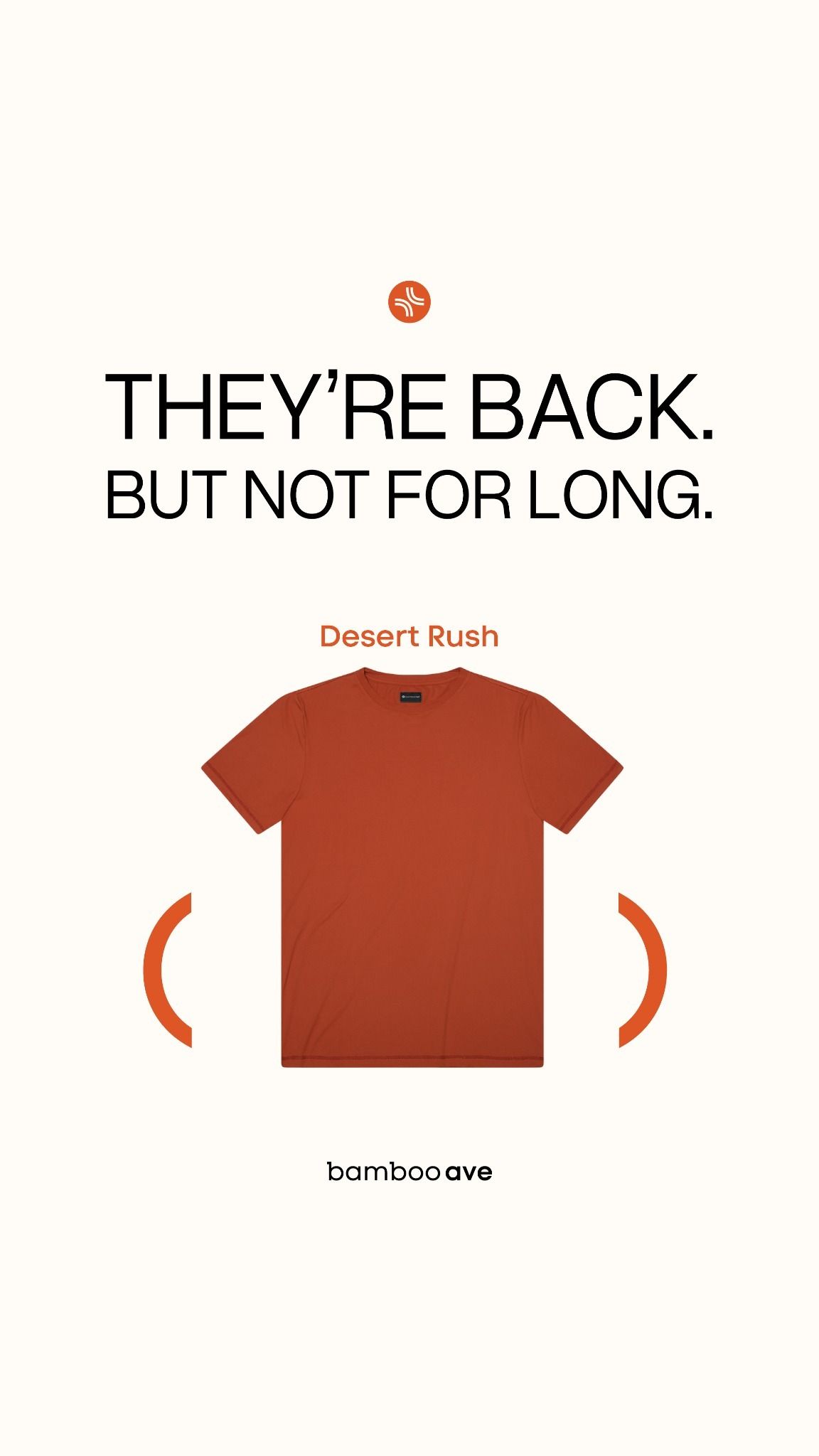
4. Bamboo Ave - Scarcity + Simplicity
🧠 Principle: Urgency framing + product hero
Why it works:
“They’re back. But not for long.” creates immediate scarcity - the easiest conversion lever there is.
Clean layout, centered hero, and contrasting accent color drive focus.
The short subhead (“Desert Rush”) adds specificity without clutter.
💡 Takeaway:
Urgency headlines work best when they sound conversational.
Pair a single scarcity trigger with strong visual isolation of the product.
5. DEUX Donut Holes - Newness + Sensory Hook
🧠 Principle: Product expansion + irresistible visual
Why it works:
“Our 3x sold out donut holes - now in chocolate!” blends scarcity and novelty in one line.
The macro shot of a bitten donut = immediate sensory cue. You can taste it.
Pink background contrasts with chocolate tones - playful, bold, instantly recognizable as the brand.
💡 Takeaway:
Whenever you drop a new SKU or flavor, lead with why it’s new + why it’s craved.
Your visuals should create appetite before your copy does.

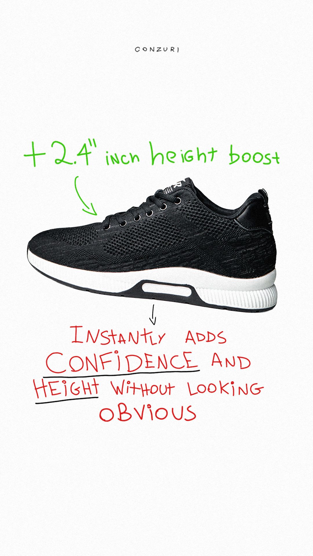
6. Conzuri - Transformation Without Shame
🧠 Principle: Outcome clarity + emotional reframing
Why it works:
“+2.4 inch height boost” = immediate measurable benefit.
Handwritten annotations create an unpolished, human tone - “confidence without looking obvious.”
White background keeps focus solely on the transformation, not the brand.
💡 Takeaway:
When selling products that solve insecurities, language matters.
Lead with empowerment (“adds confidence”) rather than exposure (“fixes your height”).
What These Ads Have in Common
Each one nails at least one of the three static ad success laws:
Clarity: A single, undeniable promise in 3 seconds or less.
Contrast: Show transformation, scarcity, or category difference visually.
Credibility: Proof through testimonials, visuals, or measurable outcomes.
They’re not just pretty pictures - they’re miniature sales pages.
🚀 If your ad account is full of static fillers instead of static winners… we can help.
Book a »free audit« , and we’ll map out how to turn your creative pipeline into a growth engine that compounds.

📧 NEW: Email Marketing Now Available
We've officially launched email marketing as a service - and we're only taking on 3 more brands before the end of the year.
The Intro Offer: Lock in our launch pricing forever. Once you're in, your rate never changes.
We'll start with a free audit of your current email setup - showing you exactly where revenue is being left on the table and how we'd fix it.
If you're ready to turn email into a predictable revenue channel (not an afterthought), let's talk.