- Brick by Brick
- Posts
- 🚨 These 6 Statics Are Printing Money Right Now (Steal Them)
🚨 These 6 Statics Are Printing Money Right Now (Steal Them)
Scarcity, social proof, and comparison... broken down so you can turn simple statics into high-converting offer ads.
Toby Waller
December 12, 2025

Welcome back to the Brick by Brick Newsletter… where 7–8 figure brands learn how to scale efficiently.
Static ads are still one of the most reliable weapons in paid social… when they're built properly.
This week, I broke down 6 winning statics across different industries, and the conversion psychology behind them.
Steal the frameworks 👇
Before we dive in, a quick announcement:
We’re taking on 2 more email marketing partners for Q1.
If you’re reassessing your retention setup or want a second pair of eyes, reply, and I’ll loop you in with Brad, our Head of Email.
To help you evaluate us, we’ll also complete a Free Campaign Redesign.
Share one recent campaign, we’ll rework the narrative, positioning, and conversion structure to show you what your emails should look like.
1. Arrae: Back-in-Stock Scarcity + Outcome Hook
Ad: Hand holding an Arrae MB-1 bottle against a blurred floral background.
Headline: “Back in Stock! Grab Yours While Supplies Last!”
Sub: “Say goodbye to cravings and hello to a boosted metabolism with MB-1 by Arrae.”
🧠 Principle: Scarcity + Outcome in One Glance
Why it works:
Back-in-stock framing tells you this already sold out once → instant social proof and urgency baked into one line.
“Grab yours while supplies last” keeps the tension high without needing timers or gimmicks.
The subheadline ties directly to pain (cravings) and desired state (boosted metabolism) - outcome, not ingredients.
The hand-held product shot feels personal and organic, not like a studio render. That increases trust and makes it feel like a recommendation, not a billboard.
🔧 How to steal it:
Whenever you truly sell out, turn it into an asset: back-in-stock campaigns should be in your evergreen rotation.
Pair “back in stock” with a clear primary outcome, not generic benefit fluff. “Back in stock – now with XYZ outcome” is far stronger than “Back in stock – shop now.”
Use hand-in-frame visuals to make the product feel “ownable” and human.

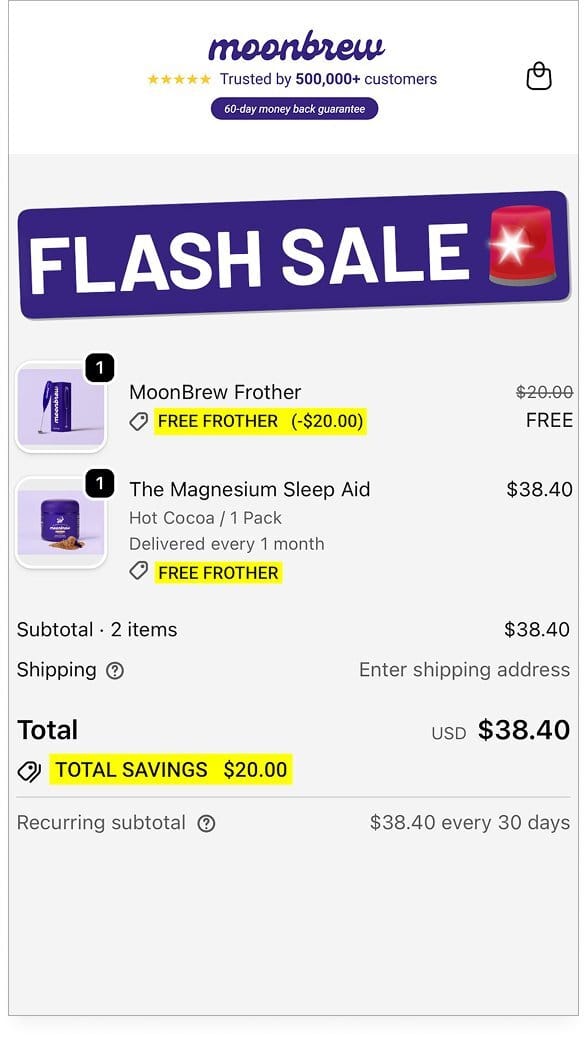
2. Moonbrew: Cart Screenshot as the Ad
Ad: Checkout/cart view with “FLASH SALE” banner over the top, highlighting:
Free MoonBrew Frother (normally $20)
The Magnesium Sleep Aid
Total savings: $20
Social proof + 60-day guarantee in the header
🧠 Principle: Native “Almost Finished” Framing + Offer Stack
Why it works:
The ad looks like a real checkout, not an ad. That instantly conveys progress: “Other people are already here.” It reduces psychological distance between the viewer and purchase.
“FLASH SALE” with a siren icon stacks urgency on top of that. Time-based + cart-based = double nudge.
The free frother line item shows the discount as a real product with a crossed-out price - this visualizes the bonus and makes the deal feel tangible.
“Trusted by 500,000+ customers” + “60-day money back guarantee” address two big objections: “Does it work?” and “What if it doesn’t?”
🔧 How to steal it:
Turn your strongest bundle or promo into a cart screenshot ad. Make the value and savings visible in context (line items, crossed-out prices, total savings).
Put your risk reversal + social proof right at the top: “X+ customers • Y-day guarantee.” This anchors trust before price.
Use this format specifically for warm traffic and email/SMS retargeting - it’s a nudge ad, not a cold intro.
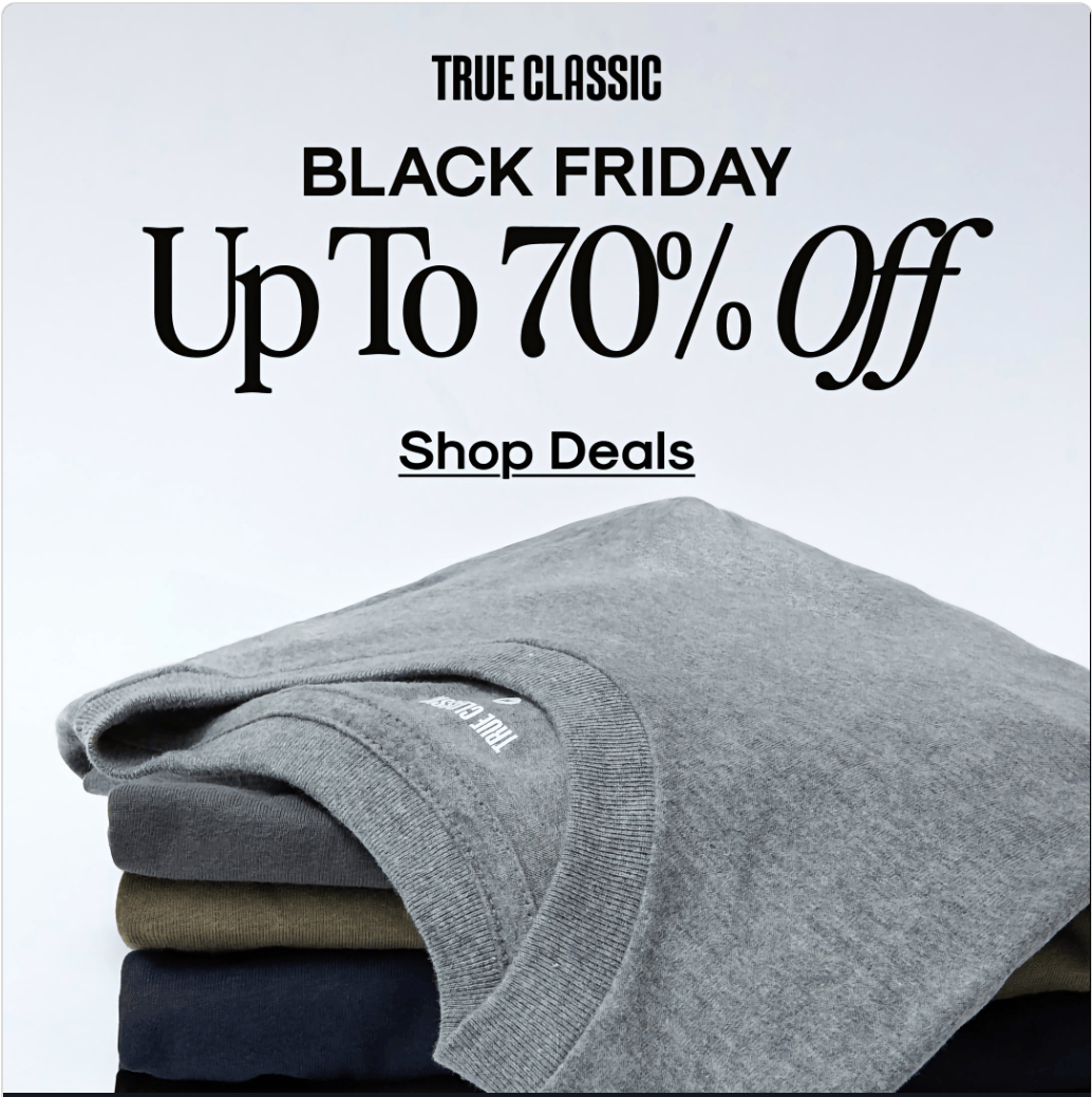
3. True Classic: BFCM Value Without Chaos
Ad: Folded stack of True Classic tees with big headline:
“BLACK FRIDAY – Up To 70% Off”
CTA: “Shop Deals”
🧠 Principle: Clean, Brand-First Discount Communication
Why it works:
“Up to 70% off” is headline-worthy on its own. They don’t dilute it with extra copy. Discount is the hero.
Simple product stack reinforces quality and basics - you know exactly what you’re getting: everyday tees at a heavy discount.
Typography and layout stay on-brand and high-end, even with a big promo. That helps maintain perceived value instead of screaming “bargain bin.”
🔧 How to steal it:
For major events (BFCM, anniversary sales), don’t overcomplicate.
Big event label
Big number
Short, frictionless CTA
Protect brand equity by keeping design minimal and premium, even when you discount heavily. Discount ≠ cheap aesthetic.
4. PR Screenshot as a Credibility Moat
Ad: Screenshot from the Evening Standard “Best food subscription boxes” article.
Tastily is labeled “Best for restaurant-level ready meals” with descriptive copy below.
🧠 Principle: Third-Party Authority + Category Positioning
Why it works:
Media logo (Evening Standard) immediately signals independent authority. You borrow trust from a name your audience recognises.
“Best for restaurant-level ready meals” positions Tastily in a specific niche within the meal delivery category. Not just “good,” but “best for X use case.”
The food photography is top tier - rich colours, plating, and textures create restaurant-quality desire visually.
🔧 How to steal it:
Anytime you win an award, feature, or “Best of” listing, make PR screenshots part of your evergreen ad library.
Highlight the “Best for [use case]” copy, not just “As seen in…” - the use case is what helps people self-qualify.
Use PR statics heavily with cold audiences and skeptical buyers; they’re pure trust accelerators.

5. Happy Ears: “Saved My Marriage”
Ad: Minimal pink background, earplug visual, giant copy:
“Saved my marriage”
Sub: “Reusable Earplugs. Design and Made in Sweden.”
🧠 Principle: Extreme Outcome Framing + Curiosity
Why it works:
“Saved my marriage” is a hard pattern interrupt. It’s an emotional, high-stakes outcome attached to… earplugs. That incongruence forces you to read again.
There’s zero mention of snoring or noise in the main line - your brain fills in the gap itself. That’s more powerful than spelling it out.
The product shot is almost abstract and design-led, aligning with a premium, Scandinavian aesthetic.
🔧 How to steal it:
Find the most dramatic, emotionally-charged testimonial you have, then strip it down to 3–4 words. That becomes your headline.
Let the main line focus on the life impact, not the function. Function can live in the subcopy.
Keep the visual minimal so the extreme statement doesn’t compete with anything. The tension between bold line + simple design is what makes this hit.

6. Dog Food Comparison: “I Tested 4, Only 1 Worked”
Ad: UGC-style static. 4 plates of dog food labeled Spot & Tango, Ollie, Maev, We Feed Raw.
Overlay text:
“I tested 4 fresh dog foods – only 1 made a difference in my pup’s coat (and poop)”
CTA: “Find Out Our Winner”
🧠 Principle: Comparison + Investigation Format
Why it works:
“I tested 4…” taps into the review/investigation format we recognise from YouTube, blogs, and TikTok. It feels like research, not a brand ad.
“Only 1 made a difference” creates a curiosity gap you want to know which one and why.
Mentioning both coat and poop addresses vanity and practicality in one line. Pet owners care deeply about both.
The overhead plate layout feels like real testing, not stock. It looks like someone actually did the work.
🔧 How to steal it:
Use “We/I tested X options, only 1 did Y” anytime you can honestly compare or benchmark. This is killer for supplements, skincare, tools, and food.
Make the visual look observational (plates, line-up of bottles, side-by-side swatches), not polished brand art. It should feel like a neutral third-party test.
Use this format as top-of-funnel content that leads to a blog/LP, then retarget with direct response offer ads.

The Thread Running Through All 6
These statics aren’t pretty for the sake of it. Across them, you’ll see the same three levers used over and over:
Scarcity & Timing
Back-in-stock, flash sale, BFCM, limited runs.
The when is doing as much work as the what.
Social Proof & Authority
PR features, bold testimonials, usage stats, “I tested X” frames.
Other people’s belief leads the pitch, not the brand’s.
Clear, Specific Outcomes
Cravings gone, deeper sleep, restaurant-level meals, saved marriages, better coats/poops.
Vague benefits don’t show up here. Everything is concrete.
If your statics aren’t converting, it’s rarely a design problem.
It’s an offer communication problem.
🚀 If your ads just feel like guesswork, rather than “hard-working sales assets”… we can help.
Book a free Brick-by-Brick Audit and we’ll:
Tear down your current ads and landing pages
Identify the offer and messaging gaps that are capping your scale
Map out a creative testing roadmap to unlock the next revenue ceiling
Hit reply with “AUDIT” or grab a slot here and we’ll take it from there.
Back next week,
Toby